The Crossing is a video installation piece created by Bill Viola in 1996. It features two videos of a man; one where he is lit on fire, and the other where he is dowsed in water. These two videos are played simultaneously on back-to-back screens. It is an example of New Media because of its use of projections of digital film to create an engaging installation space. This appeals to me because of its use of extreme slow-motion footage that gives the piece an eerie, surreal tone. I want to take note of this use of timing in my own work, making sure to match the tempo of my footage to the atmosphere I want to convey.
Author: laurafoxworth3730
Weekly Archive #7
Around & About is a video art piece created by Gary Hill in 1980. It features various shots of Hill’s apartment; each cut is timed to line up with every syllable in the monologue spoken by Hill throughout the video. It is a good example of New Media art because it blends digital camera footage and video editing with speech to create a complete audiovisual experience. I like this piece because of its rhythmic quality and how the dynamic backdrop of the visuals contrasts the rather monotone and rambling words being spoken. I want to apply the same sense of rhythm to my work by making sure my cuts complement and work with the audio I choose.
Weekly Archive #6
X is a light show commissioned by KXFS from the visual artist Max Hattler. It is a projection of various geometric shapes on a spray of water coming from a canal. It uses animation to explore the relationships between the different shapes while accenting the motion with music. It appeals to me through its simplicity; how it manages to create such an engaging visual spectacle with only simple polygons and minimal sound effects is fascinating. I want to take note of the way it experiments with the medium of animation itself (being projected on water instead of a screen) which gives it a pseudo-3D effect as well as its timing, which is relatively slow but still energetic.
Weekly Archive #4
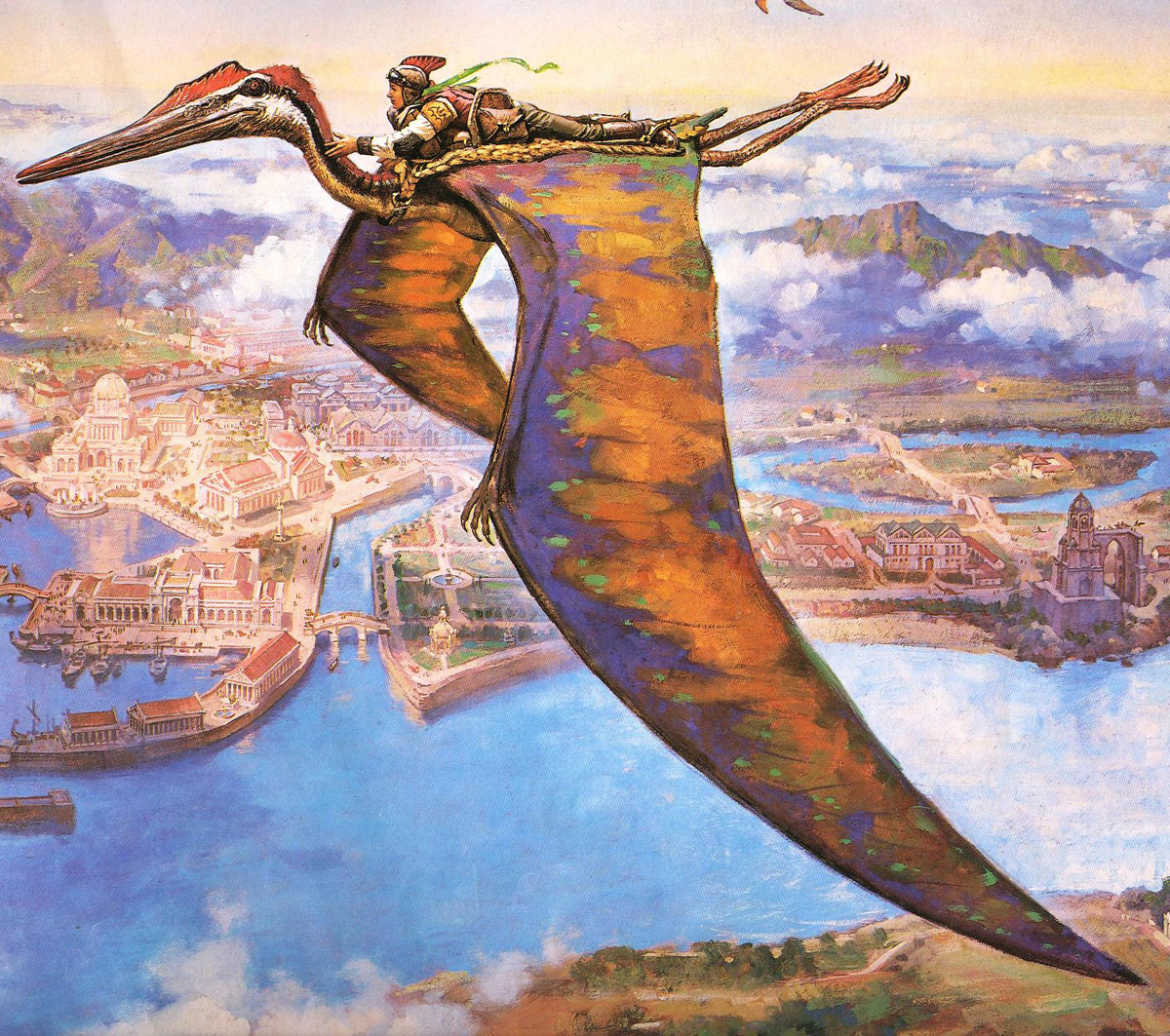
This is an illustration created for the book series Dinotopia, also by James Gurney. It is an effective and striking piece because it uses vivid colors and detail to portray the world of the novel. I enjoy the meticulous attention paid to the background that fleshes out the environment and atmosphere of the piece. The contrast between the desaturated background and the brighter hues used for the dinosaur draw your attention to the person on its back and create a very active composition. I want to experiment with complimentary colors like this artist does to add more interest to my own pieces.
Weekly Archive #3

This is an illustration of a street in France created as an advertisement for the company Mapei. This is an effective illustration because it showcases the detail of the buildings and architecture through its use of line and color. The contrast between the white areas and the bright orange/blue hues is very appealing to me because it gives the piece vibrancy and energy. This careful balance of colors can be applied to my own design work to keep my pieces from becoming too stagnant or monotonous.
Weekly Archive #2

This is a digital piece by David Em. It is a collage of 3-dimensional shapes that weave together and form an abstract series of shapes and lines. I enjoy the variety of values used in this piece. It is also appealing how this artwork utilizes both large blocks of light-colored shapes as well as the small polka-dot detail textures that add a sense of rhythm to the piece. I should apply the same utilization of dark and light values in my own line collage piece to make sure I have enough contrast.
Weekly Archive #1

This piece is a digital glitching of film footage created by Tumblr user capsule9. It combines several cuts of footage together with various digital manipulations and corruptions to produce a distorted effect reminiscent of a failing TV monitor. This work appeals to me because of the combination of text and object imagery, as well as the wide range of black/white values it switches between as it glitches. These principles can be applied to my work to make more interesting shapes and compositions; I should experiment with inverting values and making sure I utilize the full range of gray-scale tones.
 ART 224 Blog